We were tasked with giving a niche t-shirt company that created garments for custom printing a voice and a look and feel that could be own-able, and separate them from the pack. We also knew that we needed to talk directly to decorators and screenprinters, the decision makers in the chain, when it came to products being used.
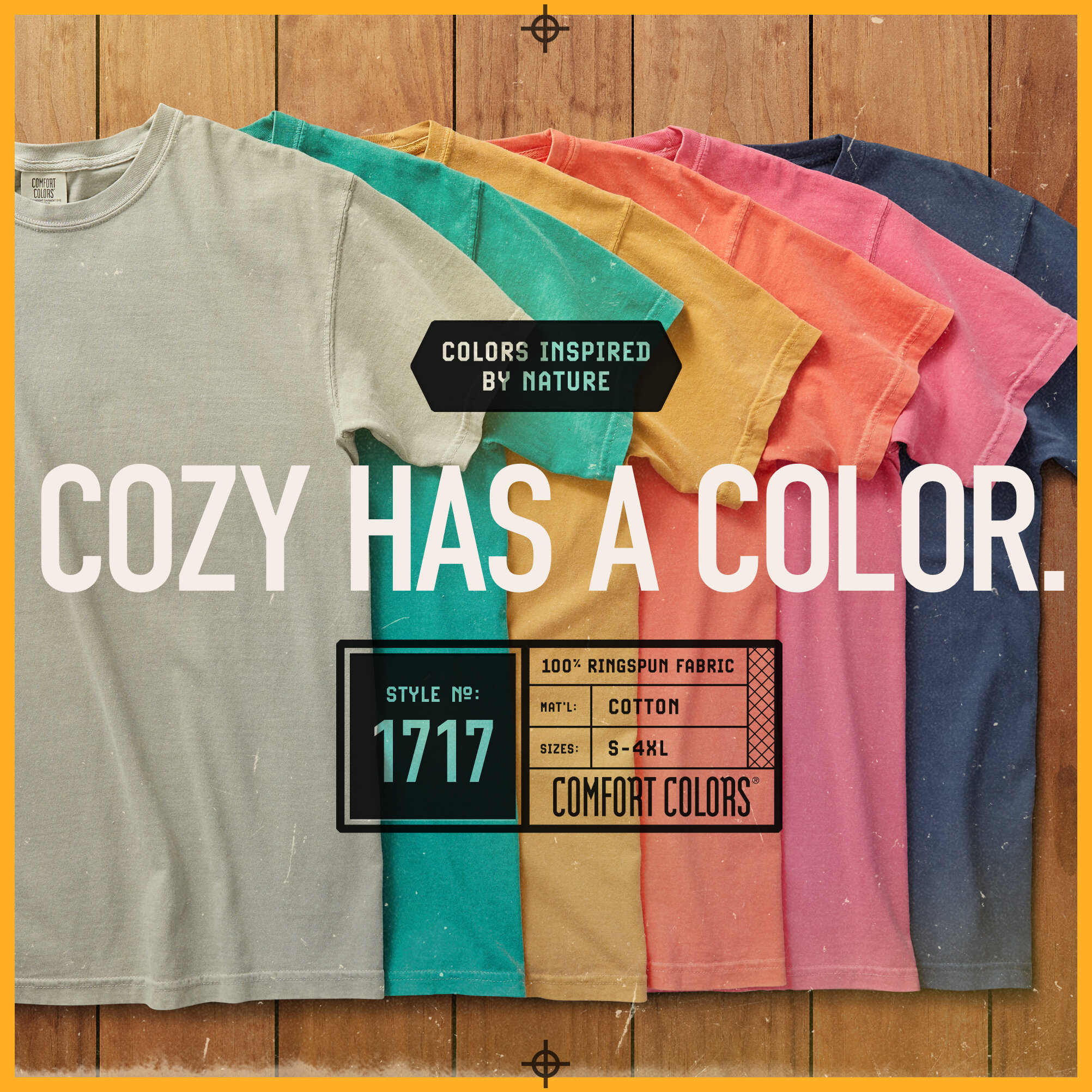
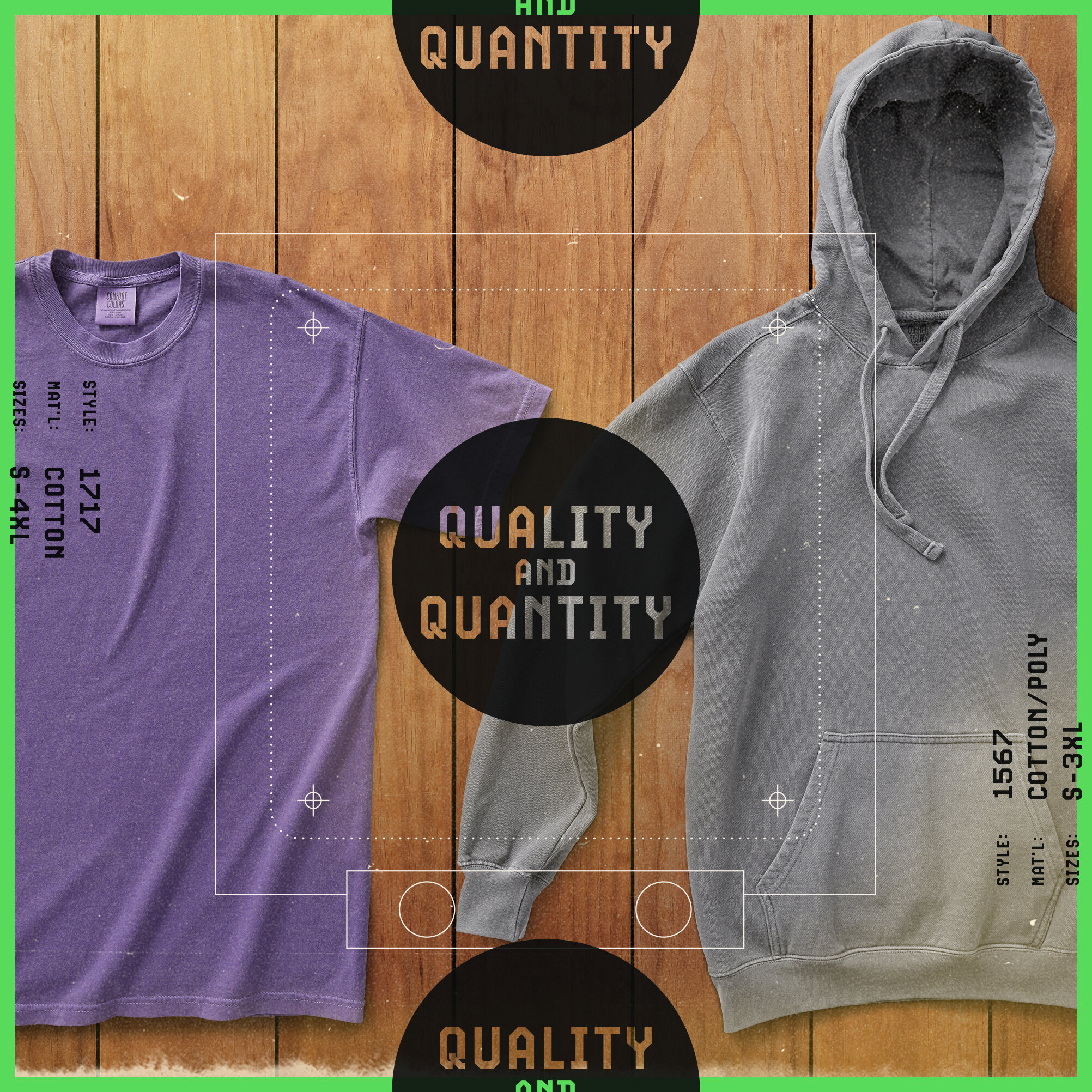
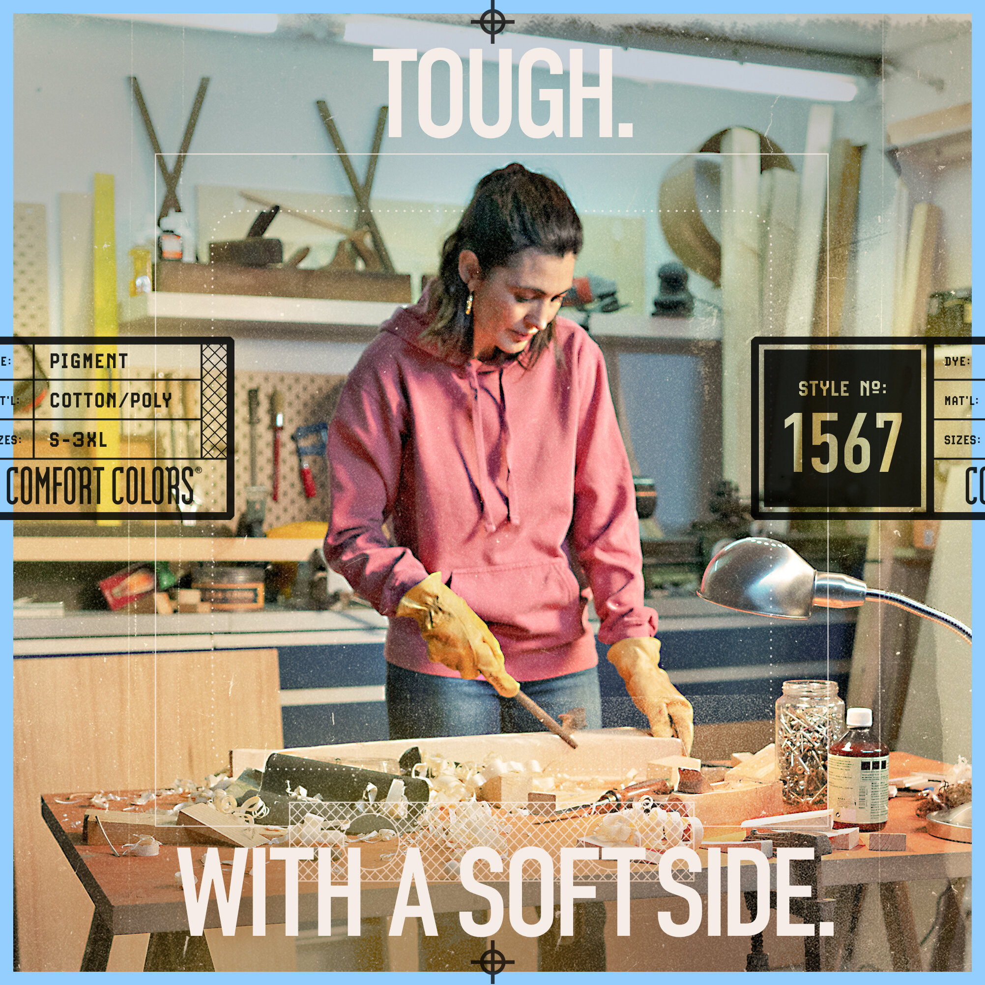
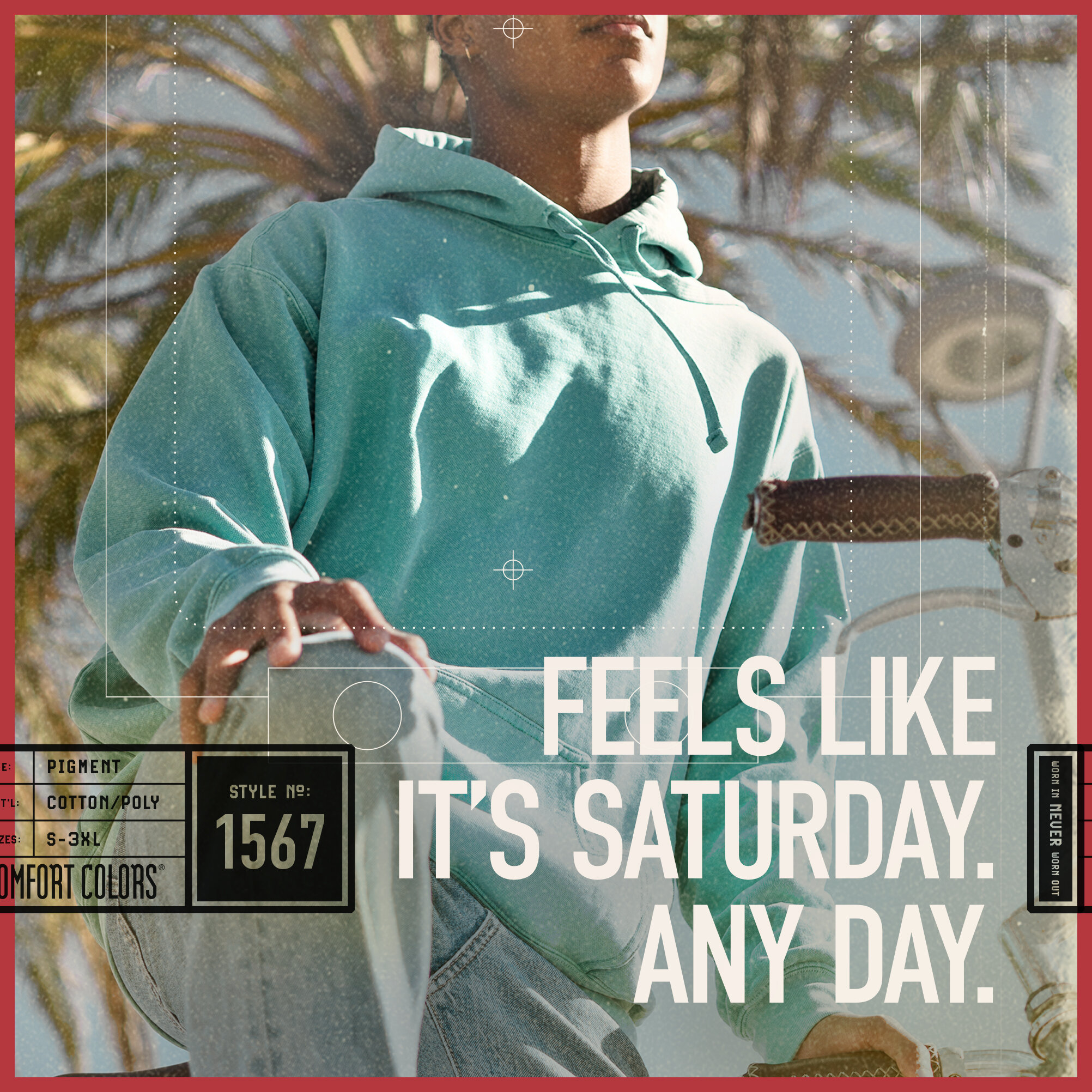
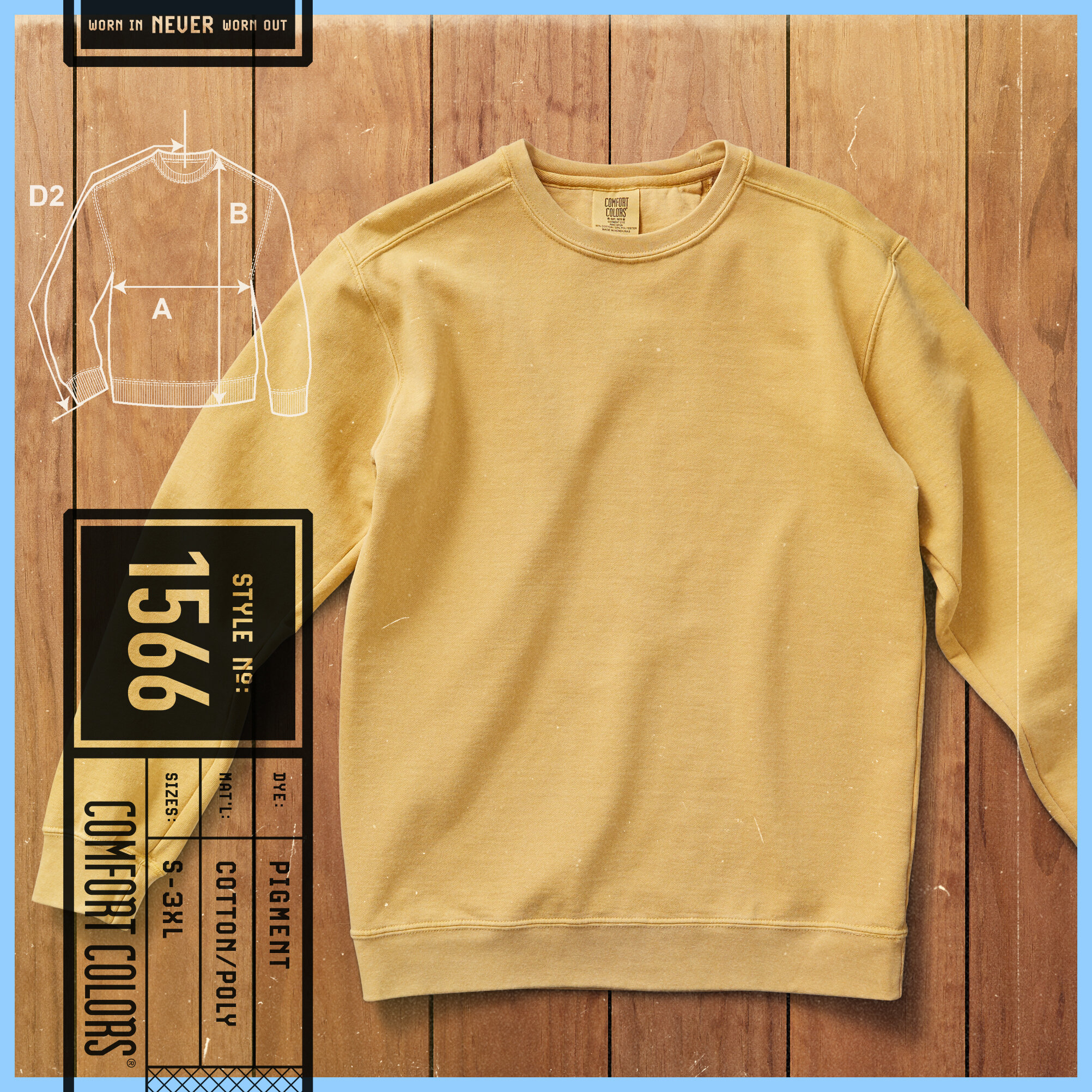
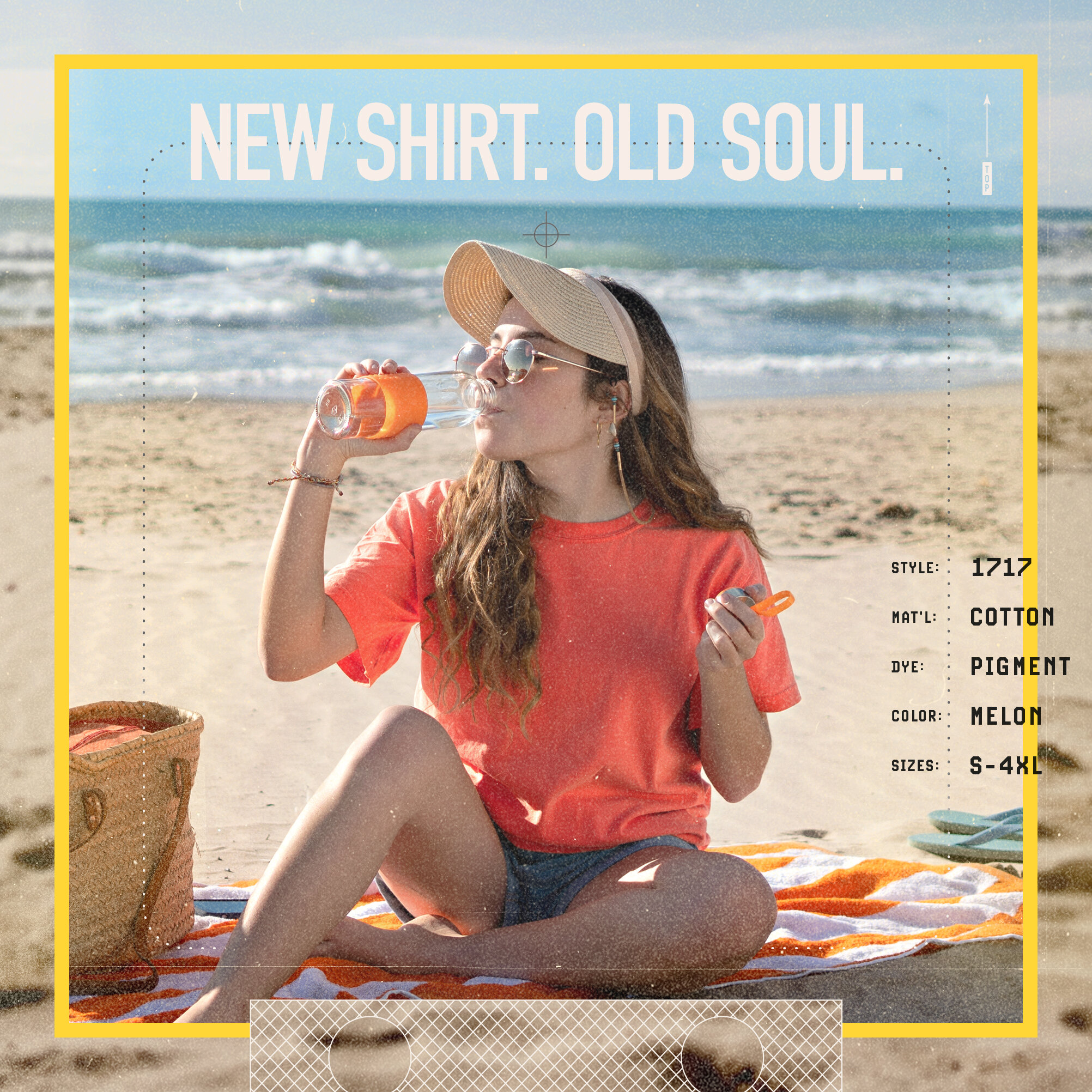
In a sea of options, one thing that stood out was that Comfort Colors was known for a worn-in, faded look – one they had honed for decades. While most in the category were opting for clean, simple and modern in their approach, we went for nostalgic and worn-in. With a test print approach that married differing styles and imagery, we were able to achieve a collected array of things that certainly didn’t belong together, but blended into something more than their parts did separately, leading to a post-modern look with a decidedly eclectic tone. The prefect way to visually convey the new platform:
“NEW SHIRT. OLD SOUL.
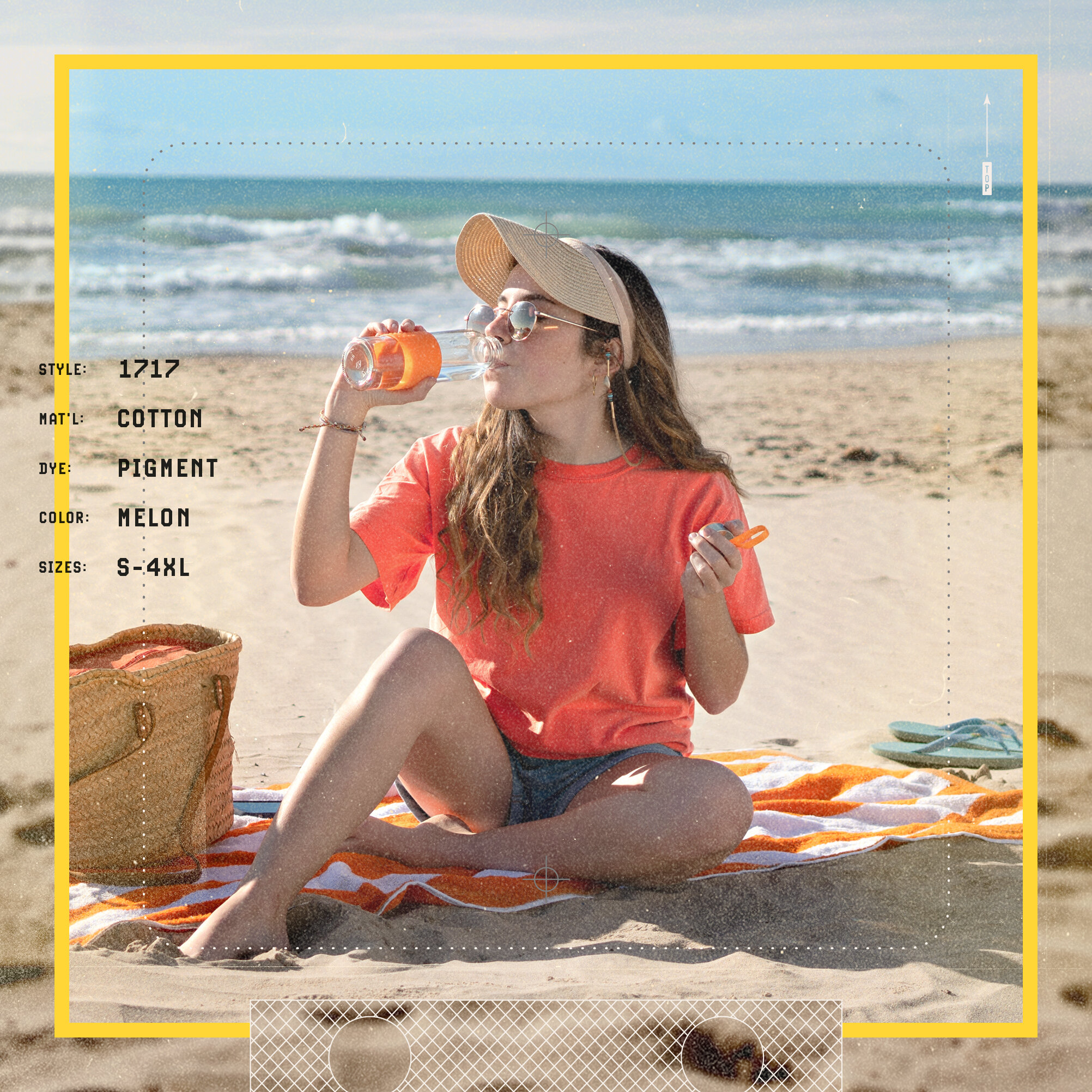
There’s an art to making a brand-new shirt feel familiar – and Comfort Colors has been perfecting it for 45 years. Our apparel is the result of decades of dedication. Every thread is thought through, from selecting the finest, softest cotton, to perfecting the process of garment-dyeing with technology of today. Every step matters. No shortcuts, no compromise. It’s the kind of quality that can’t be matched in modern times. All so we can be sure the first time you put a new shirt on, you’ll feel like you’ve loved it for years.”

BROADCAST & PREROLL


Social stories & POSTS
With social stories we took a cinemagraph approach- subtle movement that stuck with the new look and feel- that allowed the information to come forward while introducing the new brand tone and style.